Samosa Singh unveils new logo, brand packaging to target younger consumers
The brand will also be updating its menu.
Indian snack quick-service chain Samosa Singh has unveiled its new brand logo and packaging to attract younger customers.
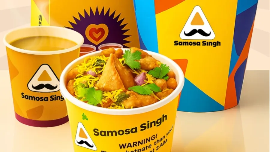
According to the brand, the new logo is designed to be modern, consistent, and globally appealing.
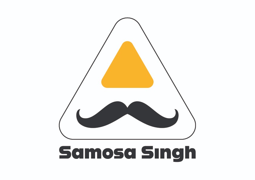
The bolder moustache is a proud nod to their roots and personality, while the cleaner lines and new typography make the logo more universally readable. The refined aesthetics elevate the brand, aligning with a more upscale and health-conscious market.
The updated logo design ensures they remain relevant in a competitive food and retail market, while the brand consistency across packaging, digital platforms, and merchandise reinforces their identity.
Samosa Singh will also introduce a special packaging that’s vibrant, Instagrammable, quirky and made from high-quality materials. This packaging is designed to resonate with Gen Z’s love for visually appealing and sustainable products.
The brand will also be updating its menu to ‘appeal to Gen Z’s adventurous palate while still being nostalgically loved by millennials.
